Using ggplot2 to visualize your data
Overview
Teaching: 35 min
Exercises: 0 minQuestions
What is ggplot2 and why should I use it?
What are aes and geom?
How do I make a basic plot?
What geoms are available?
How can I best visualize groups of data?
Objectives
Get introduced to ggplot2 syntax and philosophy.
Learn how to use most common geoms.
Learn how to use facets.
Learn to change common defaults.
The grammar of graphics
While plain R comes with its own plotting capabilities, these functions are quiet cumbersome to use as you typically have to write code for every little change you want and the code you write mostly is not very re-usable. Based on the Grammar of graphics, the ggplot2 package implements the idea that graphs can be expressed quite generally using the right way to describe them. For any given plot we have two basic concepts
- Aesthetic: What we map data to, like the x or y axis, or higher values being a darker color or bigger circles.
- Geometries: How we draw the aesthetic, e.g. take the aesthetic height and create a rectangle with a the given height.
ggplot2 provides a large set of geometries and the means to map aesthetics to these along with capability to arranging plots nicely.
Input data
Your data must be in a data frame to be really useful with ggplot2. Ideally, the data should also be fairly normalized (aka long format), i.e. each column should have all the values that go on each aesthetic, not spread over multiple columns (aka wide format) e.g.
| strain | od | medium |
|---|---|---|
| foo | 0.1 | poor |
| foo | 0.2 | rich |
| bar | 0.1 | poor |
| bar | 0.3 | rich |
Will typically be much easier to plot than something like
| strain | od_poor | od_rich |
|---|---|---|
| foo | 0.1 | 0.2 |
| bar | 0.1 | 0.3 |
This is because in the first case, each column can become an aesthetic whereas in the second, both od_poor and od_rich will likely map to the aesthetic od and this is generally not supported by ggplot2.
To tidy your data consider, using the dplyr/tidyr packages or perhaps better quickly jump back to Python pandas and export a nice csv file.
A first plot
Let’s load ggplot2 and the yeast growth data.
library(ggplot2)
growth <- read.table('data/yeast-growth.csv', sep=',', header=TRUE)
We know map timepoint and the optical density to aesthetics in a plotting object
p <- ggplot(growth, aes(x=timepoint, y=od))
And then we can add geometry to get a plot
p <- p + geom_point()
Let’s add another layer, a line this time.
p + geom_line()
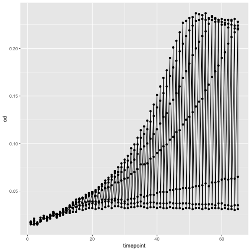
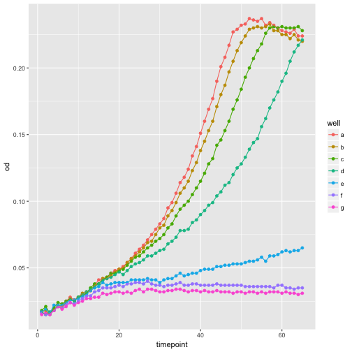
Oops, that looks funny. Why? Because we haven’t informed ggplot about the strains that each should make up a trajectory in our plot. We can do that by simply adding strain as another aesthetic, this time as the color.
ggplot(growth, aes(x=timepoint, y=od, color=well)) +
    geom_point() +
    geom_line()
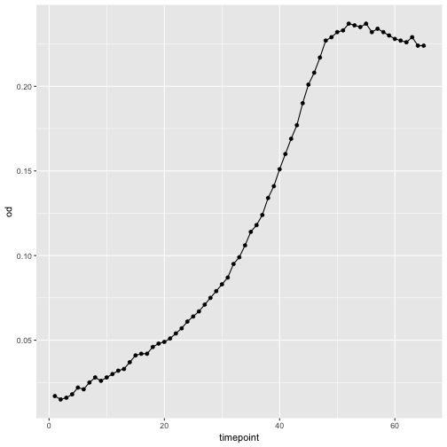
Use your data frame skills
How can you plot only well ‘a’?
Solution
ggplot(growth[growth$well == 'a', ], aes(x=timepoint, y=od)) +
   geom_point() +
   geom_line()
Transformations and trend-lines
Quite often we need to apply transformations to the data. While this can of course first be done to the data and then visualize it, it is often more convenient to do it in one step
ggplot(growth, aes(x=timepoint, y=od, color=well)) +
    geom_point() +
    geom_line() +
    scale_y_continuous(trans='log10')
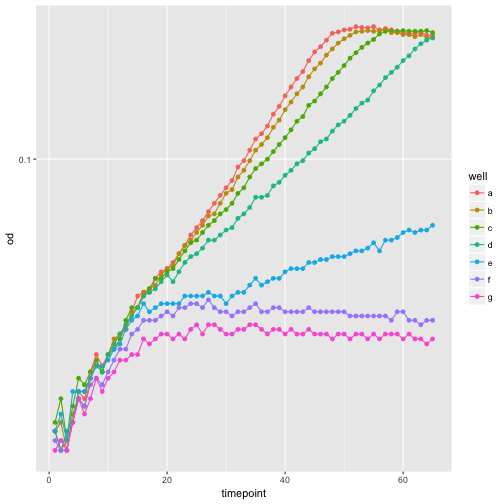
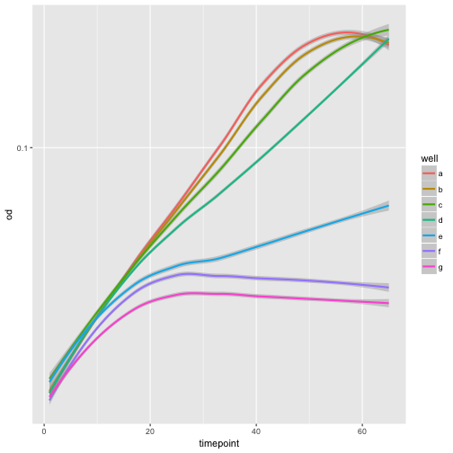
Adding a smoothing trend-line is also so common that there is an easy way to do this.
ggplot(growth, aes(x=timepoint, y=od, color=well)) +
    geom_smooth() +
    scale_y_continuous(trans='log10')
`geom_smooth()` using method = 'loess'
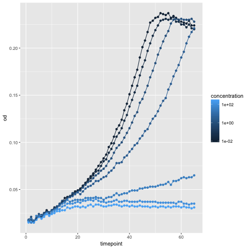
Use aesthetics to interpret the data!
Use columns
concentrationand/orconcentration_levelto come up with a plot that shows the effect. You may need the ‘dummy’ aestheticgroup.Solution (example)
ggplot(growth, aes(x=timepoint, y=od, color=concentration, group=well)) +
    geom_point() +
    geom_line() +
    scale_color_continuous(trans='log10')
Other common geometries
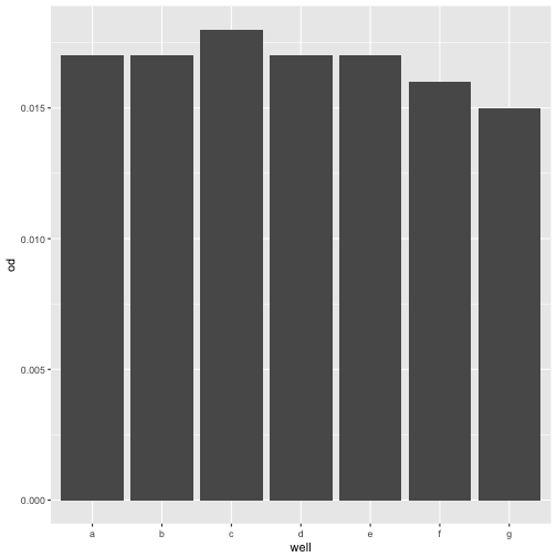
For a single statistic, such as value at a given timepoint, a barplot might be the right choice
ggplot(growth[growth$timepoint == 1, ], aes(y=od, x=well)) +
    geom_bar(stat='identity')
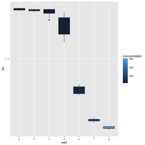
Assuming all strains had reached stationary phase after 50 minutes and we wanted to compare the final ODs, a boxplot would be a good choice.
ggplot(growth[growth$time > 50, ], aes(x=well, y=od, fill=concentration)) +
    scale_y_log10() +
    geom_boxplot()
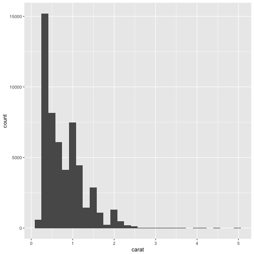
For other data, a histogram may be the right choice. Let’s load the built-in diamonds dataset for an example.
data(diamonds)
ggplot(diamonds, aes(carat)) +
    geom_histogram()
`stat_bin()` using `bins = 30`. Pick better value with `binwidth`.
Explore other geometries
Check online, e.g. http://www.r-graph-gallery.com/portfolio/ggplot2-package/ for inspiration and explore another
geom_.
Facets
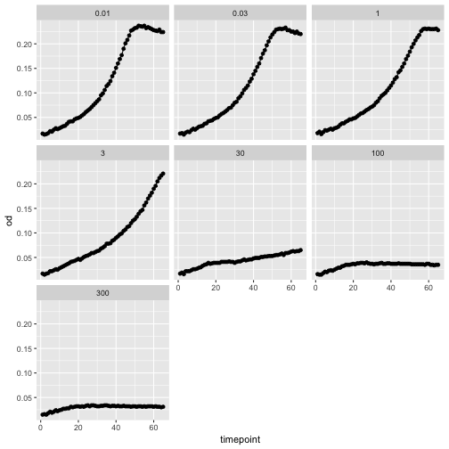
A great feature in ggplot2 is the ability to easily facet the data.
ggplot(growth, aes(x=timepoint, y=od)) +
    geom_point() +
    geom_line() +
    facet_wrap(~concentration)
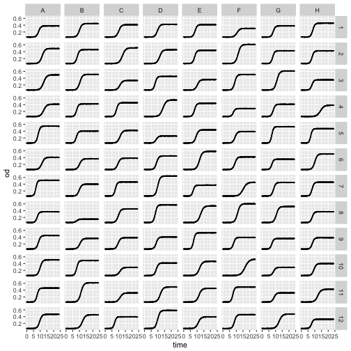
We can also use bivariate faceting, let’s read a plate of growth curves to illustrate this.
plate <- read.table('data/plate-growth.csv', sep=',', header=TRUE)

ggplot(plate, aes(x=time, y=od)) +
    geom_point(size=0.1) +
    geom_line() +
    facet_grid(column~row)
Themes
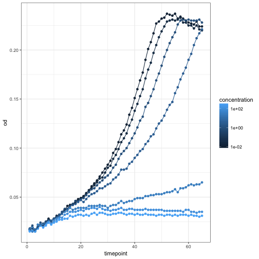
If you don’t like the default appearance, ggplot2 comes with flexible ways to customize your plots. The most high-level way of doing this is to use themes.
ggplot(growth, aes(x=timepoint, y=od, color=concentration, group=well)) +
    geom_point() +
    geom_line() +
    scale_color_continuous(trans='log10') +
    theme_bw()
Try other themes
Type theme_
and try some other themes!
ggplot2 can present data in a large number of ways, explore the
online documentation or the
R graph gallery
for inspiration.
Key Points
ggplot2 is high-level but so flexible that it replaces most needs for R’s base graphics
Generating intuitive, publication-ready graphs in ggplot2 is easy once you get the hang of it
